The contact form is one of the most important elements of generating leads from your website. Therefore, it’s worth spending time optimizing it, even when you think it’s just a simple and common section.
Here in this article, we’ll show you 6 easy tips to design and optimize your contact form to improve your conversion rate.
Before diving into specific points, let’s walk through some basic knowledge about the contact form.
What is the contact form?
A contact form is a section where you can put a series of questions asking for visitor's information, such as their name, contact, and space for them to leave a message or any question they have for your store.
Here is an example for you:
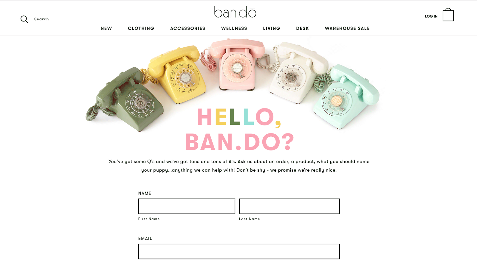
Source: ban.do
The main purpose of a contact form is to generate leads from your website. You can use it in many different ways, such as asking for customer’s feedback, encouraging them to sign up for a free gift or a newsletter, or providing them with a convenient way to leave you a comment or inquiry.
When building a contact form, your target audience should be always put in the center. This is the most important principle you should keep in mind. Are they willing to fill out the form to get a free gift, or to sign up for a coupon? Is this layout simple enough for them to follow? Is this question really necessary? These questions will help you identify the key information and ensure good user experience in your contact form.
How to design a contact form that converts?
1. Limit the number of fields
Quicksprout’s research shows that reducing the number of questions in a contact form can increase the conversion rate. If your contact form has only 3 fields, you’ll gain at least a 25% conversion rate. This figure can be substantially brought down by adding just one more field. In fact, NeilPatel.com’s conversion rate increased by 26% just by removing one question in the form.
As you can see, users never want to fill out a long contact form. If they see your form has dozens of questions, more likely that they’ll give up and go to another website. You don’t want them to do that, do you? Remember that your visitors are constantly on the move, they have so many alternative choices out there, they only want to fill out quick and easy contact forms.
Therefore, try to keep your form as short as possible. Ideally, short down your contact form to just about 3 or 4 lines. Ask for their name, email address, and their feedback, for example. This is how Teepee Joy — one of EcomSolid’s successful customer designed their contact form with only 3 questions:
.png)
You don’t need to get all of their information at once, you can always ask for other information later. Each contact form should have only one purpose and a few key questions.
In EcomSolid, they provide several pre-designed short contact form sections that you can easily insert into your store within a few clicks:
.png)
2. Maintain a single column layout
An eye-tracking study conducted by researchers from Switzerland has set 20 guidelines for improving form usability. One key takeaway from this research is that you should never split a form into more than one column.
Why you shouldn’t design a multi-column contact form? Below is an example of a multi-column contact form:
.png)
We all know that creating a multi-column form layout is a great way to reduce your form’s height. But on the other hand, it has some drawbacks:
- Not friendly for mobile devices: When viewed on a mobile device, it can be hard for your visitors to navigate a multi-column form. After all, they may have to scroll horizontally to see the entire form.
- Users skipping fields: Simply because they don’t notice them or because they confuse the meaning of the various columns.
For those reasons, a multi-column contact form can lead to form abandonment and hurt your conversion rate. Therefore, it’s recommended to present the form fields in a single column layout. Check out the example below:
.png)
3. Order form fields from easiest to hardest information
You don’t want to scare off your audience by asking hard questions at the beginning of the form. Therefore, you should start with easy questions and work your way towards the more difficult ones later. Moreover, by asking easy questions first, your audience is already investing their time and effort in the form. They’re more likely to keep filling it out.
So, which question should you start with?
Remember that your contact form is a lead generation tool designed to provide channel communication for your customers. So, when you choose questions to put into your form, imagine that the form is an actual conversation with a person. The first thing you want to find out is who they are and then determine what you want to talk about.
And as it’s a real conversation, you should only ask for what you absolutely need to push the conversation to the next level. Don’t try to collect as much information as possible. The more isn’t always the better.
For example, questions like name and email address are easy and don’t take much time to fill out. So most of the time, visitors are willing to provide this information. More elaborate questions such as credit card or bank account information, take more time, and maybe require them to grab their wallet. Think carefully about choosing these kinds of questions. If they aren’t necessary, delete them.
4. Allow for autofill
People don’t like filling out web forms. That’s the truth. So our job is to make things easier for users. Browsers have long been able to automatically complete fields on behalf of the users. In 2011, Chrome introduced the Autofill feature, which fills in the possible fields based on a user’s Autofill profile. After 4 years, Chrome found that disabling the browser’s Autofill features led to a 25% decrease in form submissions rate. Without support, some users are just going to abandon the form.
It’s understandable because users are constantly filling out information every day for various forms. Most forms ask for the same type of information, like their first name, last name, phone number, email, and address.
.png)
Your visitors would get tired of having to fill out the same information all over again. Therefore, by enabling users to autofill, you’ll encourage more people to complete your forms and you’ll have higher conversion rates.
5. Make your calls to action (CTAs) stand out
The CTA is one of the most important factors when it comes to design a contact form that converts. CTAs guide your website visitors and tell your audience what happens next. Your CTA must stand out on the page, be strong and catchy. By helping your CTA stand out on the page, you’ll engage more leads and get them to fill out your form.
How to do that? Here are a few suggestions for you:
- For the CTA text: According to research from Unbounce, using “Submit” as a CTA can decrease your conversion rate by as much as 3%. Demanding CTAs like “Download” and “Register” saw poor conversion rates as well, while more informal CTAs such as “Go” and “Click here” saw better performance. Therefore, you can show a little personality in the CTA, such as “Let’s Chat”, “Get Started”, Work with Us”, etc.
- You can also think about adding a sense of urgency in your CTA to maximize your conversion rate. When your visitors feel an opportunity is limited, they are more likely to take action immediately. For example, instead of “Submit now”, you can say “Submit now - only 24 hours left”
- For the CTA button color: According to Ning, the most popular CTA color choices are red, green, yellow, and orange because they are bright and attractive. The least common colors are black, white, brown, and gray as these colors are neutral, they blend with the backdrop easily. You can choose based on the background color and other design elements of your website. But whatever color you choose, make sure this color sets the button apart without clashing with the site's overall design.
Let’s see some examples of great CTA.
.png)
EcomSolid chooses the “Get It Free” CTA button on their homepage. It highlights that EcomSolid provides a free community plan for users to try before paying anything. At the same time, the orange color of this button matches its branding color and stands out on the white background of the website.
Crazy Egg also has a smart CTA - “Show Me My Heatmap”. This CTA makes it irresistible as it taps into the power of using the customer's voice.
.png)
6. Inform users about error messages
When users fill out the form, they tend to make mistakes every now and then. It's inevitable. Therefore, it’s important to communicate effectively with users to help them fix it. Users will get frustrated easily if they have to re-do the form again because of a mistake they didn’t notice.
Here are three main principles you should keep in mind when designing errors report feature for your contact form:
- The error warning should be easy to notice and understand
- The error field should be easy to locate
- Users shouldn’t have to memorize the error fixing instructions
There are many ways to highlight areas that need to be fixed. For example, highlight error fields in Orange or Yellow. You shouldn’t use Red because it could overstimulate your visitors.
.png)
You can also use a message below the field to guide your customers, like the example below:
.png)
Completing a form takes time and effort. Try to support your audience by giving them alarming error messages. And also, reassure them that the mistakes they made are no big deal and correctable.
Your turn
Now you know how to optimize your contact form. It’s time to review your store, make some changes, and see how it will leverage your conversion rate.
If you have any questions about optimizing your contact form, don’t hesitate to leave us a comment.
-------------------------------------------------------------------------------
This article is a guest post by EcomSolid. EcomSolid is a new Shopify theme aiming to skyrocket your sales. It’s the best theme for dropshipping businesses, PODs, or branded online stores. EcomSolid gives you greater freedom to build a high-converting Shopify store with outstanding features and sales booster add-ons.

