Navigation menu
Optimizing your conversion rates is a highly effective approach to ensuring your sales keep growing as your store gets bigger. At the early stage of an ecommerce business’ development, marketers quite rightly focus a lot on traffic. But what at first is a useful approach can later become a problematic habit.
Continuing to drive more traffic to your store gets more expensive once you have already connected with the low-hanging fruit in your customer demographic. What’s more, the quality of traffic may well be worse, so there’s no guarantee your sales will benefit.
Instead, if you’re a medium to large Shopify or Shopify Plus store, you should be aiming to get more from the traffic you already have. In a recent blog we discussed the basics of conversion rate optimization. Today, let’s jump straight into 5 quick fixes and 2 long term solutions you can follow to improve your store’s conversion rates.
Long term solution 1 - Optimizing your value proposition
Your value proposition is a short phrase or sentence that clearly explains what you have to offer. It should crystalize how your products solve a problem, what benefits they will bring to the customer, and what sets you apart from your competitors.
Your value proposition is a great place to start because you’re going to be using it again and again in your marketing – on your home page and landing pages, in welcome flows for your SMS, Push notification, Messenger or email marketing, and in ads.
Getting it right is a great way to optimise conversion because it will help customers come to a faster decision about whether your product is for them or not.
Here’s a great example of an optimized value proposition by Apple.

In 3 words, Apple communicate 2 user values that really matter to their audience: having a laptop that is light, and owning a product that is ahead of the competition. The clever wording even helps to reinforce their brand identity.
This optimized value proposition helps Apple customers understand quickly and intuitively what the product is all about. And this helps customers come to faster decision as to whether the product is right for them - in other words, they convert quicker.
Here are 3 simple steps to optimize your value proposition:
1. Filter out hygiene factors
2. Identify the most important values for your customers
3. Present your value proposition in terms of benefits rather than features
Step 1 – Filter out any hygiene factors.
The concept of hygiene factors comes from a theory about motivation, but it can also be applied to the features of your product or store.
Put simply, a hygiene factor is something that has to be there, but will not motivate a purchase by itself. For example, if you’re selling toys for kids, the fact that your toys are safety tested is a hygiene factor. No one is going unsafe toys for their kids. But if you tell your customers “Our toys meet international safety standards”, that’s not going to convince them to make a purchase. You need to tell them about the developmental benefits, how easy they are to store, or the range of different ways your kids can use them.
So your value proposition should not contain any hygiene factors – you will need to mention these things at some point, but not here.
To figure out if a feature of your product or store is a value or a hygiene factor, you need to have a clear idea of your buyer persona. Define your audience, then make a list of things that are hygiene factors for this persona.
For example, you may think that a flexible returns policy is a value to your customers. But is it? In a recent survey, more than 30% of Generation Z shoppers said they expect to return over 75% of the products they buy online. So for them flexible returns may just be a hygiene factor. So, for a fashion store focused on Gen Z shoppers, you shouldn’t be mentioning flexible returns in your value proposition.
Step 2 – Identify your most important values for your customers
Now you have filtered out any hygiene factors, it’s time to focus on your most important values. You will probably identify more than one value that you offer to customers. But for your value proposition to be effective, it has to be short and clear. So be disciplined and make sure you focus on the most important values you give.
How do you identify these?
- First, think about your user persona. What matters most to them? Price, quality, choice, status? Talk to your customers and read through your customer feedback – this should give you a good guide as to what matters most.
- Second, think about your market. What are your competitors offering? Are there any values that only you offer? Your products might be healthier, more environmentally friendly, or featuring unique technology.
Use these two considerations to zoom in on up to 2 values that you offer.
Step 3 – Phrase your value proposition as a value, not a feature
Make sure your value proposition is value focused rather than feature focused (the clue is in the name). Having identified 2 important advantages you have to offer, now it is important to make sure you present these in a way that is focused on the user. One trap marketers fall into is to focus on features, rather than values. Naturally, you can mention the features of your product or store, but it should be crystal clear what value this brings to the customer. And in general, it’s better to focus your value proposition on what customers get, rather than how they get it. For example, when customers are buying speakers, what they really want is great quality sound. So talk to them about the sound, not the speakers themselves.
So, a simple 3 step solution for optimizing your value proposition is:
1. Cut out any hygiene factors
2. Pick your best values
3. Make sure they are communicated as values, not features
Long term solution 2 - Optimizing your blogs and content marketing
Content marketing is always going to be a longer term approach to boosting sales. Its value comes in its ability to improve SEO, build brand affinity, and help customers in the middle and lower levels of the sales funnel.
But the fact that you won’t get instant results doesn’t mean you shouldn’t think about content marketing and blogs. It is a cost effective approach – research shows it can generate 3X the number of leads per dollar that paid ads can. For long term cost-effectiveness, it’s a smart move.
And, whether you are just getting started with your blog or it is already well under way, taking time to optimize your blog posts is a great way to maximize their impact. After all, if your blogs are successfully bringing traffic to your site, your next question should be: “Are we getting the most out of this traffic.” This is where optimization comes in.
4 Steps to optimizing your blogs
Let’s go through 4 simple steps you can follow to ensure your blogs are fully optimized.
Step 1 – Map out the conversion path from your blog
The first thing to get your head around is what you want customers to do after they have read your blog. So much of the planning and time goes into getting them to your blog – from keyword research to metadata and headline testing – that very often the question of where they go after gets neglected
Ask yourself this question about each blog or content piece you create:
What level of awareness is someone reading your blog likely to have?
- They could have a general awareness of a problem. For example, I need a present for my girlfriend.
- They could have a general awareness of a possible solution. For example, jewellery is a popular gift choice for partners.
- Or they could have a specific understanding of the solutions on offer. For example, jewellery brand X and jewellery brand Y are the most popular brands this year.
You should be supplying them with links throughout the blog that take them up to the next level of awareness (we’ll talk about how to present these links in a moment).
For example, if they are reading a blog called “10 great gift ideas for your girlfriend”, then offer them links that are focused on specific gifts as a possible solution. For example, “5 reasons jewellery is a great gift idea” or “10 things to think about when buying jewellery as a gift.”
And from these blogs you could then lead them on to a specific blog comparing the most popular brands of jewellery.
In terms of links to product pages, it is definitely OK to provide links in any kind of blog. You might present a product and it can be love at first sight. But, especially for blogs at an earlier stage of awareness, limit the number of direct links to product pages and try to link instead to other content that will help them make an informed decision.
Step 2 – Embed links and CTAs within the text of your blog
Once you know which links you want to include, it is important to embed them into your text. This means that, rather than relying on CTA buttons or pop ups, links are presented as someone reads through the blog.

In our recent blog on Black Friday insights, we also included an embedded link to our Black Friday guide. We used the text “preparing your Black Friday strategy for 2019” as this gives a clear indication of what the linked content will help the user to do.
In research by Hubspot, 96% of the leads from a specific post came from links embedded in the text rather than CTAs at the bottom of the blog. That’s because links get around the problem of banner blindness, where pop-ups and banners are instinctively ignored by readers.
So include links to both product pages and other content as embedded links. And think about the anchor text – this is the text that is highlighted within the hyperlink. The anchor text will be critical for helping your users understand what the link refers to and what they will get by clicking it. They can also impact SEO – google uses anchor text from links to understand what the page being linked to is about.
Step 3 - Find multiple ways to include your CTAs
We’ve already mentioned embedded links, which should be the most effective way to get leads. But you should definitely include other CTAs on your blog posts.
Include a banner with a CTA at the bottom of the page, and potentially one more half way through the text. Here’s an example of a banner text and CTA included in a recent case study we published:
Ready to discover how push notifications can add an extra level to your marketing mix?
Install FirepushPop-ups are definitely another option, especially if you can present a really compelling offer to your readers. This might be:
- A free, high quality resource such as an ebook or guide;
- A free trial for your product;
- An exclusive deal or package.
In general, customers are wary of pop-ups, so if you are going to interrupt someone’s read with a message, make sure it is a good one.
A less intrusive alternative to pop-ups is a chat bot. Adding a chatbot, like the one offered by Tobi, to your blog pages can be a great way to start a conversation with a potential customer. You could set up a flow that presents more content to them, or introduces your product range to them.
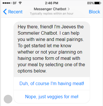
(Source: Chatbots magazine)
This example by Sommelier presents 2 clear options to get the conversation started, and can then lead shoppers to either more content or some product recommendations.
This blog contains chatbot message flows you can copy and paste to get you started.
Step 4 - Analysing the traffic and conversion rates of your existing blogs
The final step is to make the most from your existing content and blogs. Here you want to look at 2 metrics, traffic and conversion rates. There are 2 blog types that are ideal for optimization:
- Blogs with high traffic but low conversion rates
- Blogs with high conversion rates but low traffic
Blogs with high traffic but low conversion rates:
The first thing to do with these blogs is to check the time spent on page. If it is very short, you have a problem with the content itself and you will probably need a complete rewrite, plus think about adjusting the design and images to make it more visually appealing.
But if the time on page is OK, then you should be looking to add additional CTAs, or optimize the way they are presented. Try embedding some of your CTAs as links in the text, and amending the wording to your CTAs to make them more compelling.
Blogs with high conversion rates but low traffic
With these blogs, you know that once a customer lands on the page they are performing well. Your challenge now is to get more people reading the blog. The first step to follow here is to add more links to this blog from your other content. Then of course you can adapt the headline, URL and meta texts based on keyword research to help the blog perform better in search.
You now have 2 detailed, long-term strategies that will help you to optimize conversions and improve the overall performance of your sales funnel.
5 quick fixes to improve your conversions
Let’s take a look at some quick fixes that can turbo boost your conversions today:
- Improve the images and descriptions on your product page
- Include customer testimonials and make them more prominent
- Use chatbots
- Set up selling on Facebook and Instagram
- Streamline your checkout
Quick Fix 1: Improve the images and descriptions on your product page
You can never expect to replicate the physical aspect of shopping with your ecommerce store. But you can give customers a precise and clear ‘feel’ of what they are about to buy - so they can do so with confidence. And this will increase the chances of them converting.
The simplest and best way of achieving this is by optimizing the images and descriptions on your product page.
The importance of images to the shopping experience has never been greater - just look at the rise in shopping on instagram for evidence of this.
So, how do you optimize your images to perform best?
1. Make sure your images are high resolution but quick to load, with the option to zoom in and get a closer look at the details.
2. Provide shots at a range of angles to ensure shoppers get a full picture of your product. You can also use services like Arqspin, which allow you to create a high-quality 360° “spin” of your products.
3. Experiment with props and lighting to create compelling images that will draw shoppers in.
This gives the customer as complete a view as possible without actually being there.
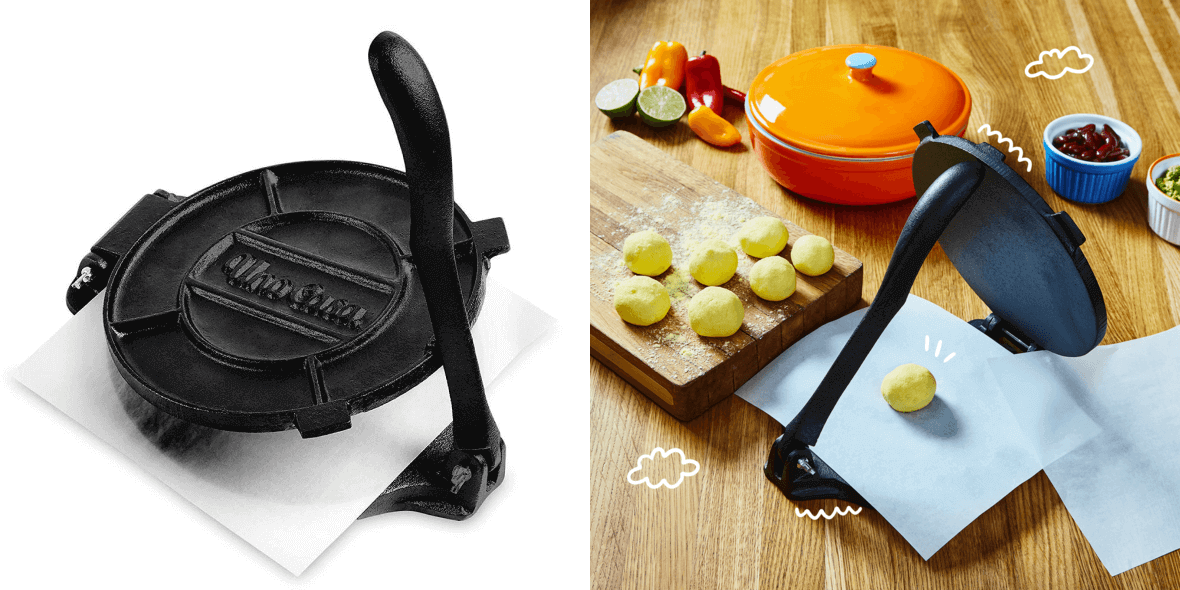
These product shots of a tortilla press by UnoCasa hit all the optimization criteria. The images are high quality and zoomable. The product is presented from a range of angles, and in different usage situations. The addition of props gives a clear idea of product dimensions, plus they help to create visually interesting product pictures.
Of course, customers like to see their potential purchase ‘in action’ too, especially things like items of clothing. This is a great opportunity to showcase some ‘social proof’ and demonstrate that there are other people out there who have bought and enjoyed your product - nothing builds trust better than happy buyers sharing their positive experience.
For example, the gourmet coffee store Intelligent Blends do a great job of incorporating user generated content into their web pages.

So you have the visual aspect covered, as well as social proof that what you’re selling is desirable to others. Now, you need to evoke an emotional connection to your product, a feeling that your potential customer’s life will be improved by making this purchase. The best means at your disposal here is the age-old technique of creative writing.
Rather than simple manufacturer’s descriptions of your product, aim to tell a story. Take the bracelets produced by Pura Vida for example - each bracelet has its own unique connection to a local artisan from a developing country, and the company’s ethos is sold more as a lifestyle choice than a simple transaction.

Pura Vida’s detailed product descriptions enable customers to identify closely with their purchase, giving them a feeling that they are part of a movement, a cause.
Quick Fix 2: Include customer testimonials and make them more prominent
Building on the concept of ‘social proof’ that we introduced above, we arrive at customer testimonials and reviews. Nearly 70% of consumers rely on online reviews before making a purchase. Those are big numbers. By showing people how customers just like themselves have used and enjoyed your products, you build that essential trust and confidence that people require before finalizing the deal.
Choose positive reviews from as wide a variety of satisfied customers as possible - you want to show that your product is for everyone. Display them prominently not only on your product pages, but potentially elsewhere on your site too. The testimonials you choose to display should be detailed and useful, giving details as to how and where your product was particularly well-received. This gives potential customers a better idea of their peers’ overall experience with your product, rather than a gushing review about how awesome it is.
You can do this manually, by simply finding reviews you like and including them on your page. Or, for a more advanced approach, you can try tools such as bazaarvoice, which will automatically find and integrate customer reviews onto your site.
Ultimately, these user-generated endorsements are the most valuable marketing tools at your disposal - there’s no need to be shy with them. Show off your success stories loudly and proudly, and watch your conversions increase.
Quick Fix 3: Use chatbots
We mentioned building an immersive experience for your customers - one that replicates the physical aspect of shopping as closely as possible. Part of that experience includes personal assistance - being on hand to quickly and efficiently handle any queries or problems a customer might have.
83% of consumers want some sort of support in their online shopping journey, and they want it quickly. In fact, 51% of shoppers will either try only once or give up immediately when seeking help before an online purchase; so if you’re not there, the sale is gone.
24/7 support is a big investment - so automated chatbots are a smart solution. They can be customized to provide in-depth answers to the most common queries and issues, waiting unobtrusively in the background until called upon. Shopify chatbot apps like Tobi provide Facebook Messenger bots that are simple to set up and offer a great way to engage your customers.
Once you have chatbots set up, you can configure your messages to provide conversational marketing. This is a strategy that aims to make the customer feel like they're having a real-life conversation about their wants and needs. Some chatbots can even recommend different products based on the customer's answers. Learn how to implement conversational marketing into your business.
With live chat reportedly boosting conversion rates by 45%, incorporating it into your Shopify Plus store is a simple fix that you cannot afford to miss out on!
Quick Fix 4: Set up selling on Facebook and Instagram
Social media platforms like Facebook and Instagram have been a popular way for businesses to promote themselves for years now. These popular sites are easy places to engage with potential customers - 87% of eCommerce customers say that social media now plays an important role in helping them make a shopping decision.
And if you haven’t made your social media profiles shoppable yet, it’s time to take the plunge. You can create buy buttons on your Facebook page, curate shoppable Instagram feeds and drop links to your shop and products via your bio and in comments. Engage your followers with user-generated content (photos, testimonials, memes and even influencer endorsements), and give them an easy option to immediately purchase the products that they identify with.
Quick Fix 5: Streamline your checkout
Time is an increasingly precious commodity for everyone. So a tedious and lengthy checkout process is a surefire way to quickly lose a customer’s interest.
Streamline your checkouts by simplifying things:
- remove all unnecessary text, buttons and navigation to make the experience as smooth as possible.
- Make sure you allow guest checkouts - having to create an account is a big turn off for many customers.
- Make sure you offer prices in the local currency - Shopify now offer 10 currencies you can add to your Shopify Plus store.
- Offer multiple payment options, and clearly display security credentials with badges and logos.
A swift and efficient checkout will reduce your rates of the dreaded abandoned cart - it is estimated that 7 out of every 10 items added to a cart on an eCommerce site never end up becoming purchases.
Optimize and test to drive the sales
Instead of focusing on just getting more traffic, as this blog shows there are loads of strategies you can employ to optimize your store. A good starting point is to pick one long term strategy and 2 or 3 quick fixes. Then make sure you test everything to see how your changes are impacting your desired conversion.


