Navigation menu
So you have traffic. And sales. Great job … but here’s the bad news. Now you have to find an answer to the question:
“How do I keep growing my sales?”
The typical answer is get more traffic. Because more traffic will mean more sales. Well … maybe. But it is going to become progressively harder, and more expensive, to keep driving more traffic to your site.
Consider this situation. You’ve used google adwords to get traffic to your site, and found some cost effective search terms to bid for. Once they start to peak in terms of how much traffic they can deliver, you’re going to need to move on to other search terms, which might be considerably more expensive.
Making more of your traffic
A smarter approach would be to get more out of the traffic you already have - more engagement from your social followers, more subscriptions from those who visit your site, more orders from your subscriber base, and more additional purchases from your existing customers.
And the way you do this is through CRO – conversion rate optimization. Today we’re going to go through how to optimize 3 key aspects of your marketing so that they convert better. Here’s what we’ll cover:
1. Defining a conversion
2. Optimizing your conversion path
3. Optimizing your home page and landing pages
4. Optimize your product pages
5. Optimizing your marketing campaigns
6. Testing
Defining a conversion
The first step in this process is to think carefully about what a conversion is. It may seem obvious – a conversion is a sale, right? – but it is actually more complex than that.
Depending on the stage of your store’s development, your business model, and your values, you might define a conversion as:
- A click through to your website
- A certain amount of time spent on your site
- A visit to a product page
- An opt-in to one of your messaging channels
- An item added to a cart
- A purchase
- A review after the purchase
- A return purchase
In terms of your site, conversions are often considered in terms of a conversion funnel like this.
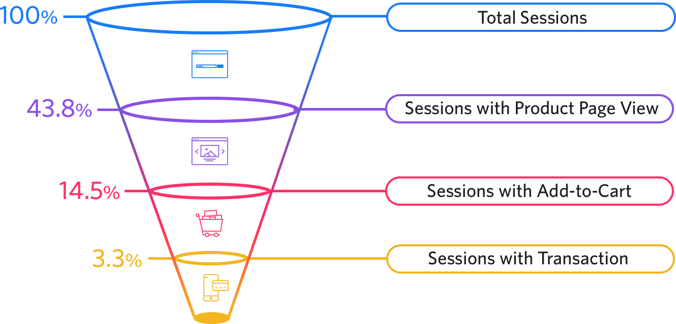
So there are plenty of conversions to choose from. And if you don’t think carefully about which ones you are focused on, you may end up robbing Peter to pay Paul.
This can be an especially big problem in a large marketing team where everyone has different KPIs. They can all end up chasing their own conversions, whilst harming someone else’s or the overall performance of your store.
Let’s imagine a scenario. Your PPC specialist’s KPI is more clicks from their campaigns. So they set up an ad campaign that gets loads of clicks because it over-promises. Your content manager, whose KPI is time spent on the website per visit, has created lots of detailed content designed to educate users. So when users from your ad campaign hit your site, they don’t stay for long because the content doesn’t match their expectations.
This kind of situation can occur at every stage of the customer journey – prioritising one conversion means sacrificing another.
The solution is to be clear on what conversion is most important to you. To do this you need to:
- Understand you brand
- Understand your audience
- Understand where you are now
Clarify exactly what your priorities are: raising awareness, building your brand, boosting customer loyalty, increasing customer lifetime, becoming more profitable. Then select the right conversion or conversions to fit your business needs.
Once you’ve done this, you’re ready to start optimizing.
Optimizing your conversion path
The conversion path refers to steps a customer goes through to convert. You can think of it as the clicks they have to go through to reach the goal you want from them.
One aspect of optimizing the conversion path is reducing the number of clicks needed wherever possible. We will deal with this more in the section on optimizing your marketing campaigns.
But the main aspect is about creating a clear path with steps that follow on naturally from one another. This helps you avoid losing customers along the way – which is not good for conversions.
Reducing bounce
Think about this scenario. A customer lands on a page on your site. They already have expectations of what they are going to see and learn based on the content or material that has led them to your site in the first place. This could be an ad, a social post, a search results page, a link on another website, or something else.
So the first thing you have to ensure you do is ensure that your page delivers on the expectations you have created. If you don’t do this, you will lose the customer before you even get a chance to convert them.
This is known as bounce – when someone lands on your page and immediately clicks back. It’s terrible for your SEO, and of course bad for your sales. So, how do you fix bounce? Well, there are a lot of strategies you can try – here’s a good summary of some of the most effective ones.
Ensuring consistency
The number one point with your conversion path is to ensure consistency between your ads, social posts, and meta texts (the texts that are shown on Google when you appear in a search), and what customers see on your landing pages or home page.
Here are 3 tips to follow to ensure you achieve this:
1. Create clear guidelines for your ads, social content and marketing campaigns. The number one reason for your landing pages not meeting customer expectations will be because those expectations have been set too high by your ads. Clickbait style copy and visuals might get lots of clicks, but you’ll only end up with a high bounce rate afterwards.
2. Land customers to the most appropriate page wherever possible. You can ensure you do this by structuring your ads and posts based on stages of the customer journey.
- Awareness stage ads focused on introducing your product should land on your home page.
- Consideration stage ads focused on educating your audience about your product should land on either blogs or dedicated landing pages. These can be focused on testimonials and reviews, or on the technical details of your product and comparisons.
- Conversion stage ads or retargeting focused on closing a sale should land on dedicated pages for promotions and sales, or product pages.
And if you don’t have the right landing page for a specific type of campaign, make one. For example, if you’re running a Black Friday sale, create a specific landing page just for this sale (this is what we suggest in our detailed Black Friday strategy). This way, customers who click on a post about your Black Friday Sale get straight to the details of what you’re offering, rather than landing on your home page and having to find the sale themselves.
3. Ensure your meta texts and URLs are descriptive and clear. Meta texts are the texts that are shown as search results in a Google search result. You want these texts to address a user need, include keywords you are aiming to rank for, and accurately what the page is actually about. Here’s how the meta texts for a recent blog we published appear in a Google search for “Black Friday abandoned cart blog.”

The meta title (“Black Friday abandoned cart marketing guide – Firepush”) gives a clear overview of what the page is about, while the description includes details of what you will find: “timing, templates and content for Black Friday abandoned cart messages.”
By following these 3 steps – clear guidelines for ads and social posts, thinking carefully about where you land customers, and giving clear descriptions in your meta texts – you can ensure you reduce your bounce rate. Making sure the content of your pages matches customer expectations is the first step in optimizing your home and landing pages. Next you need to think about design and content.
Optimizing your home page and landing page
Your home page and landing pages are usually the first time that customers can really get a look at, and feel for, your brand and products. They may have got a peak at what you offer from an ad or a social post, but this is when they will really start building an impression of you as a store.
As we have already established, different stores may be aiming for different conversions, depending on their audience, business model and products. When optimizing your landing pages and home page it is essential to have a clear focus on what you want the customer to do next. A smart idea is to understand how much time, and how many site visits, your average customer needs before they make a purchase and whether they face any obstacles during their interaction with your home / landing page. To collect such data you can use various UX research tools that are available on the market.
If they need a lot of time, and multiple return visits to your store, then having ‘add to cart’ as the conversion for your home page doesn’t make sense. Instead, target conversions such as opt-ins (to push notification, SMS, FB Messenger or email), clicks to review or comparison pages, or time spent on the page.
On the other hand, if your audience are generally fast to make purchases, choose clicks to product pages or ‘add to cart’ as your conversion.
Having selected the conversion that’s right for you, let’s take a look at some strategies for optimizing your home and landing pages.
Optimization is a complex process. We have prepared a list of great apps to help you be more efficient in developing your store and sales.
Strategy 1 – Understand user behaviour on your existing page
You’ve though about the transition onto your website. Now it’s time to think about how users progress through your website and convert the way you would like them to.
The first step in this process is to take a look at your existing website to understand its strengths and weaknesses. There are some great tools out there for analysing how users interact with your pages. The first to try is a heatmap – this is an overlay on top of your page that shows where users are clicking.
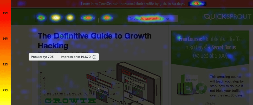
As you can see, this is a great way to get a visual representation of what users are doing on your page.
Another smart tool to try out is a scroll map. This is another overlay, but this time it shows how much different sections of your website are viewed.
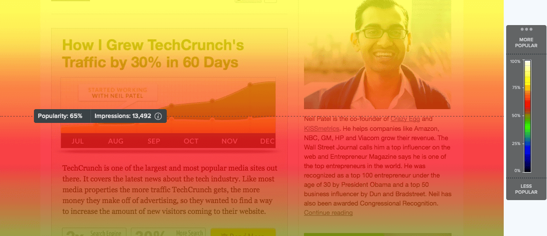
When you apply a scroll map to your page, the color scale indicates how popular each section of your page is. White, yellow and red show a high level or impressions, while greens and blues show fewer impressions.
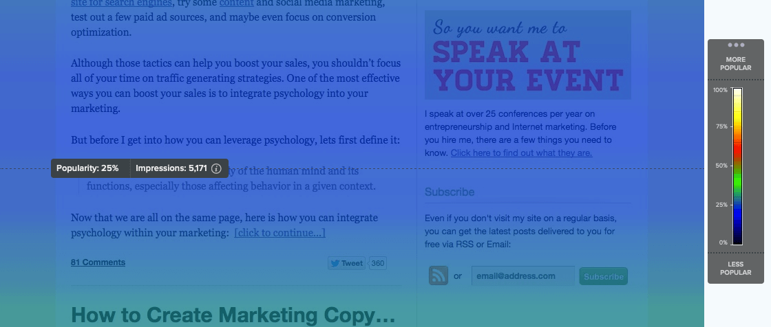
Once you have applied these overlays, create a list of the elements and content on your page that get the most clicks and views from your users.
Now compare this list to your conversion objectives and see how they match up. Are your users clicking on the buttons and links you want them to? Are they reading the content that will encourage the conversion you want?
Once you have these insights, you’re ready for strategy 2.
Strategy 2 – Optimize your above the fold elements
With your insights on user behaviour ready, you can start making changes to your page. And the best place to start is your “above the fold” section. This refers to the elements of your page a user can see without having to scroll down. And for optimization, it is the most important area to focus on.
Where the fold is will depend somewhat on what device your users are reading your page on. But a scroll map (as explained in the previous strategy) will enable you to identify which parts of your page are viewable to all without having to scroll.
Usually, your above the fold elements will include:
- A headline
- A subheading
- An image / video
- Calls to action (up to 2)
And you want all these elements to work together to improve conversion. Let’s look at them one by one to understand how to do this.
Your headline and subheading:
Here you want to present your value proposition to the customer as concisely and clearly as possible. A good structure to use for writing these texts is:
Headline: Present a very clear user benefit
Subheading: Give a simple explanation of your product or service
In some cases you may be able to show in images what your products are and how they work (for example, if you run a fashion store, showing images of your latest pieces will already clearly communicate what you sell). In this case you can omit the subheading, or use it to explain something unique about your products – specific materials, social or environmental values etc.
Finally, don’t forget your brand tone of voice. Look for ways to express your value proposition that reflect your brand and identity as well as what you offer. This landing page by Dollar Shave Club is a great example.
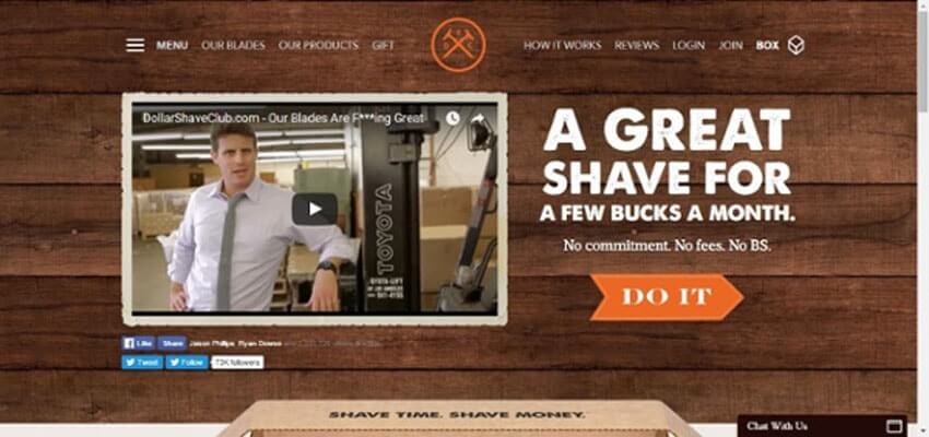
They present a clear user benefit – “A great shave for a few bucks a month” – and back this benefit up with clear, simple points about how they do this – “No commitment. No fees. No BS.”
And in terms of tone of voice, use of language like “a few bucks” and “No BS” really help to establish their informal, straight-talking, and humour-oriented brand.
Your image or video:
You want your image or video to reinforce and support the value proposition that you have set out in your headline and subheading.
You also want it to support your brand identity, just as the tone of voice used in your headline does. Images and video are great for evoking emotion and mood. So aim for a visual element that shows a user benefit while stimulating an emotion you want to associate with your brand.
This landing page by Tortuga Backpacks uses a striking image to do exactly this.

The image clearly supports the user value that you can fit everything into one checked-in backpack. But it goes much further, to also create a sense of adventure and exploration through the image. The use of colours combined with a traveller immersed in a new location creates a strong impression around the brand.
Your calls to action
When marketers think about optimization, a lot of the focus will be on calls to action. Calls to action are typically displayed as buttons with a short, direct statement encouraging clicks. And, ever since Google … by changing the color of its call to action buttons, these elements have received a lot of focus when marketers are aiming to boost conversions.
There are really 3 ways you can improve the performance of your call to action buttons. Change their position on the page, change the text, and change the color. Let’s briefly explore each of these.
1. Position on the page: Your heatmap should give you a good idea of where users tend to click more. So make sure you position your call to action buttons in these locations. Another simple yet effective trick is to simply have more call to action buttons (but all focused on the same conversion) on your page above the fold. This way, even if users miss one they will still see the others.
2. Text: Calls to action have to be short and urgent – they are almost always expressed as commands: “Buy now”, “Learn more”. You can divide the text you use into two broad categories – strong actions and soft actions.
Strong actions are for closing a sale quickly, so you want them to be direct and forceful.
For strong actions, try verbs like:
- Get, Buy, Shop, Download, Sign up.
Soft actions are for encouraging customers to spend more time getting to know your product before a purchase.
For soft actions, try verbs like:
- Compare, explore, try, test.
3. Color:The color of your call to action button can influence both how visible it is, and where it is clicked over an alternative call to action. On your site, you probably want your call to action button to fit within your overall color scheme in order to maintain brand consistency. But within that color scheme, look for the color which contrasts most with your pages dominant colors. Colors are also perfect for testing, because changing the buttons is very simple. So run tests with different color options to see which converts best.
Here’s a great example by Dropbox of an above the fold section that has been well optimized.
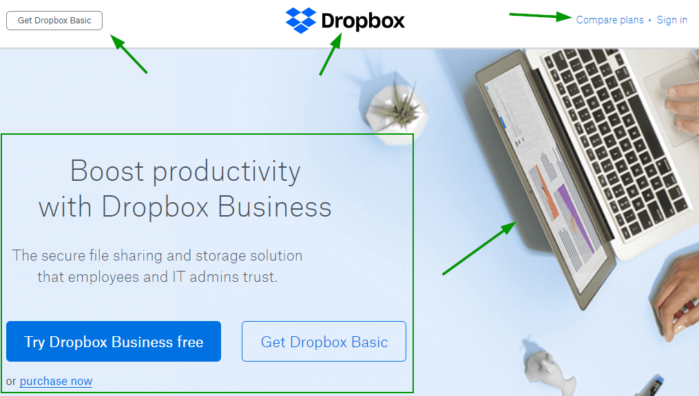
What makes it work?
- It features a headline with a clear value proposition that’s focused on a user benefit.
- This is followed by a subheading that describes the product clearly.
- The image clearly develops the theme of productivity, while its minimalist aesthetic creates a feeling of focus and clarity.
- There are 5 calls to action in total.
- Color is used to differentiated between the 2 call to action buttons – the stronger blue draws more attention to the preferred conversion – “Try Dropbox Business free”.
- The call to actions combine a mix of strong actions (get, purchase) and soft actions (try, compare).
So, now you are armed with some strategies, go ahead an optimize your home page and landing pages. Use heatmaps and scroll maps to understand user behaviour, then adapt your layout and design to match your desired conversion. Then focus on the above the fold section to make sure the headlines, image and calls to action are fully optimized. Often great way to find ideas how to optimize your website is to track what users are looking on it by adding a search option.
Optimize your product pages
We have entered a new eCommerce era that has brought in the demand for some severe industry changes. One such change is the need for higher page loading speed and better user experience when users shop on mobile. Customers are more impatient than ever before, so they usually won't wait for a page to open for more than a few seconds.
Google came up with the perfect solution for it!
AMP (Accelerated Mobile Pages) is an open-source protocol that dramatically improves the web pages’ load speed for mobile devices.
Why should you consider giving a try to this trending AMP format for your Shopify store?
- Speeds up page loading up to 3 times
- Reduces the bounce rate and abandoned carts
- Improves the average time visitors spent on your store
- Improves your SEO visibility on Google
- Simplifies the buying process
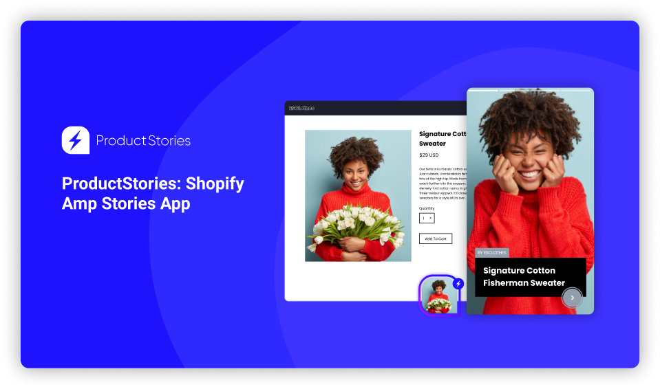
You can get all these benefits mentioned above with tools like ProductStories that can automatically convert all your product pages into AMP pages and create a modern and unique experience online shoppers will enjoy. This app uses the familiar web story format to catch users' attention in lovely floating widgets that open your page's AMP version.
So, with the ProductStories app, you get:
- Simple AMP Converter for your Shopify product pages
- Story Widgets that load the AMP format of the product page that look great on any Shopify theme
- Advanced analytics to track your views and impressions
Please note that this AMP app is forever free for up to 25 active product Story widgets.
Also an important point to consider is making your store multilingual. Weglot has a powerful and easy-to-use solution. It is simple to install and is compatible with all CMS and website technologies.
Optimizing your SMS, Push notification, FB Messenger and email marketing
Much of what we have mentioned already will apply in some way to your marketing campaigns too. This includes:
- calls to action (which apply to all channels),
- your value proposition (which you will want to use in welcome messages when users first subscribe),
- and thinking carefully about where your messages link to.
The number one factor with any of these channels that will drive conversions is personalisation. For example, personalising push notifications can increase conversion by up to 88%.
Here are 3 ways you can personalise your campaigns:
1. Personalisation can be automated - you can send abandoned cart, price drop, or back in stock messages to users that will be specific to products a user is interested in.
2. Beyond automated messages, you should also be aiming to segment your audience so that you can send offers or content that you know is relevant to a specific audience group.
3. Finally, you can personalise calls to action to make them feel more immediate. Instead of a call to action like “Claim discount”, make it a first person statement – “Claim my discount”. In a recent test, the call to action “Create my account” performed almost 25% higher than “Create your account.” This more personal tone is appropriate for messages and emails, as the users have already subscribed so a relationship has been established.
There are also a few specific points to bear in mind for individual channels.
For SMS
With SMS, the limit of 157 characters is going to restrain how much you can say. So follow this simple structure for composing high converting messages:
1. A user problem or goal – Struggling with …?
2. A call to action that presents a product – Grab a …
3. An exclusive offer or perk – Free shipping on all orders today
4. A link (make sure you have shortened the link to save characters using a link shortening service like this one.)
One way to enhance personalization is by creating coupon codes, a common SMS marketing tactic, that is unique to a campaign or demographic. This will make the promotion feel more relevant and exclusive, increasing the chances of click through.
For Push Notifications
Use rich pushes (we call them Power Pushes on Firepush) wherever possible. Adding images of a product or related to a campaign increases engagement. For example, Pura Vida Bracelets get 1.1% CTR from these forms of push notification, and have driven over $360,000 in revenue from them in just over a year.
Write a clear title just like a subject line for an email. You can try a title that focuses on the curiosity gap - For example, “This season’s big hit!”. This title creates intrigue and encourages users to open the message to find out more. Another smart technique is scarcity, especially if you are running a promotion. Here’s an example sent by Inkedshop:
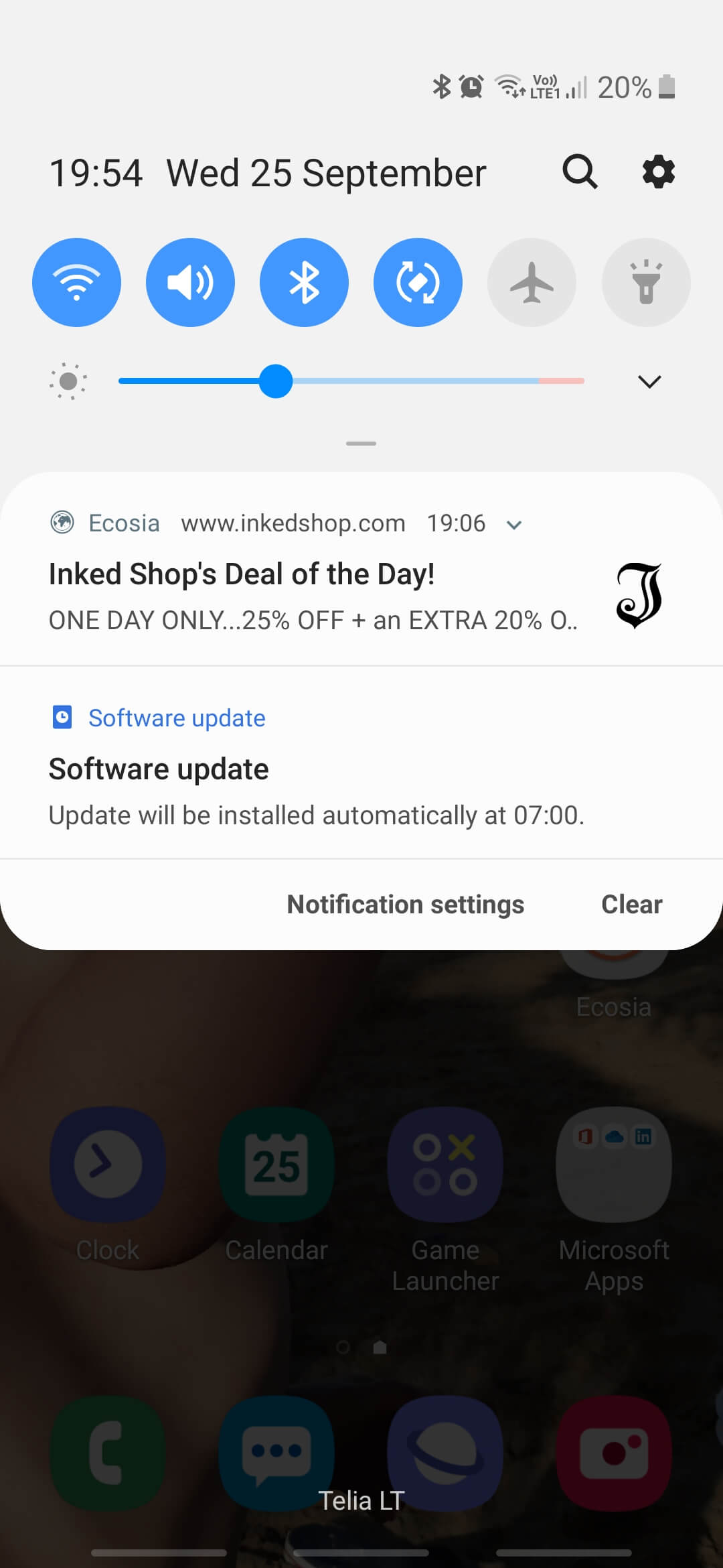
The title a first piece of copy emphasises clearly that the offer is available for one day only.
Finally, be concise with the main text of your message. Present a quick benefit (such as the discounts mentioned in Inkedshop’s example above), and then a call to action.
For FB Messenger.
With FB Messenger, many of the techniques for Push Notifications will work well. This includes using images and GIFs.
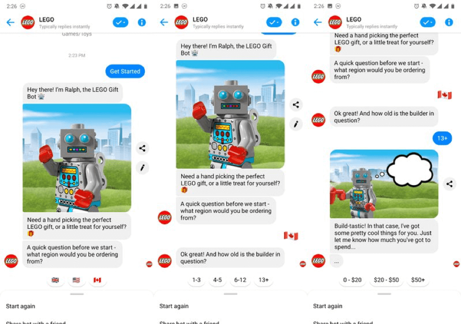
The main difference with this channel is that it is more conversational. This means you have more time and space to explain what you are offering. It also means customers expect more interaction and personalisation. So you will need to present clear options for them. These could be part of a longer flow (where you ask questions in order to present them with the right products or offers for them), or simply different links that a customer can choose from.
Here’s a great example of how Lego use images and a conversational form to create effective FB Messenger flows.
For email
The subject line is clearly key for email success. As with push notifications, you can try lines that focus on scarcity (“Only available today …”) or the curiosity gap (“This gift idea has solved Christmas …”). Question forms are also popular because they feel interactive. To be optimized for all desktop and mobile channels, you should aim to keep your subject line to 35 characters or under.
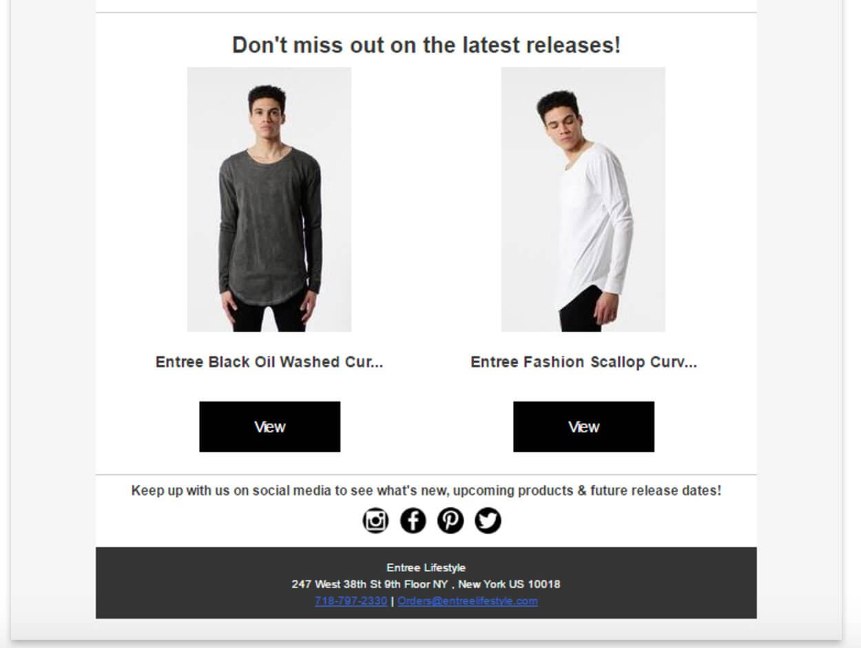
You can follow the same principles we discussed for the above the fold section of your landing page. A headline focused on user benefit, a compelling visual, and multiple optimized CTAs.
Keep the body text of the email to a minimum – aim to do your explaining or persuading on the landing page you have prepared. Your email is aimed at getting that click.
This email from Entrée Lifestyle follows a minimalist approach, with a simple headline, images, and two strong calls to action.
As we have mentioned already, with each of these channels think carefully about where links land to. Misleading your subscribers just to get a click is not going to be effective. Across all channels, make sure you set clear expectations of what you are offering, then having a landing page that delivers.
Test everything and keep on optimizing
We have focused a lot on content and layout today. And this will be really important for getting the ball rolling with your optimization. But the next step is to test, test, test. Your audience and product offering are unique, so you need to figure out exactly what works for you.
With testing, think carefully about exactly which elements you’re testing (text, visuals, CTA, layout) and what you want to learn. For figuring out where to start with your testing, the PIE system is great. Then remember to do your testing gradually. Treat optimization as an ongoing process rather than a final result.


